Thursday, December 26, 2013

Digital Painting - Poster Critique


Today, please work for 80 minutes, then:

Monday, December 16, 2013

Special Lighting Effects

Even though this is done with real paints, take a look at how the painter in this video approaches putting white into his painting to add light. Watch from about 2:00 to 3:50.

What you should look for:
  • How much lighting is applied to the underlying color?
  • How does he make the wet watermelon look extra shiny?

Thursday, December 5, 2013

Poster - Completion Dates


This schedule should give us time to finish our projects before December ends. Percentages of completion can be shown as:

  1. 20% - Sketch & Composition - Finished 11/29
  2. 20% - Values (Shadows) - Finished 12/6
  3. 20% - Colors - Finished on - Finished 12/13
  4. 20% - Lighting Effects - Finished 12/20
  5. 20% - Refinement - Finished 12/27
    • 100% - Total

Currently, I expect your poster to be roughly 40% done today. That means that your sketch should be finished and your second step (whether shadows or colors) should be nearing completion - say 75% at least.

By the end of December, we can look into printing our posters and return to animation.

Tuesday, November 19, 2013

Painting for a Poster


For the next two days, I'll give you time to continue working on your sketch or to begin adding shadows.

  • On Thursday, you'll turn in a progress check image.
This speedpaint video shows a process that lets you keep your lines while still having a painterly look:

Monday, November 11, 2013

Finishing the Sketch - Before Painting

So, what is the big difference between painting and drawing? Addressing this question, we'll be taking a look at the necessary ideas to make your sketch cross the gap from drawing into becoming a full painting.


For this week, here's your assignment:

Wednesday, November 6, 2013

Compositional Balance

Introduction: http://ctrlpaint.com/videos/principles-of-design-introduction

Balance - http://ctrlpaint.com/videos/principles-of-design-balance

Orcs - http://ctrlpaint.com/s/ctrlPaint_orcs_02.PSD

Assignment: Begin a sketch -or- arrange some orcs in a compositionally-balanced piece of work at your proposed poster size.

Monday, November 4, 2013

Assignment: Printing a Digital Painting

For printing, you'll need to choose a paper size that you'll be happy with. I'd recommend A3, B3, or A2. 

Please begin to consider what you'd like the subject or theme of your painting to be for when we meet tomorrow. The requirements of this assignment will be:
  1. Make sure your painting is in the correct dimension for the size at which you'd like to print
    1. Consider your DPI (probably 300+ is best)
    2. Consider how much of a border you will need.
  2. Please work at double-size, so that your poster can be compressed if necessary, or printed at a larger size.
  3. Consider, as you begin your sketch, the composition of your painting 
    1. Since you will be printing it as a poster, the compositional layout will be one of the most important graphic qualities for your viewers.
  4. This assignment is tentatively due December 13.

File:A size illustration2 with letter and legal.svg
File:B size illustration2.svg

Monday, October 28, 2013

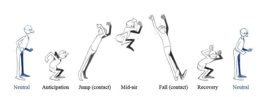
Principle 2: Anticipation

Now that we've had a good chance to practice Squash and Stretch, let's look an idea that works together:

Anticipation!
You may be familiar with the idea from science that all action requires an equal and opposite reaction:

Anticipation is a very similar idea - a character is going to get ready for an action with a little bit of preparation. A good example of this is the sneeze - a lot of facial wiggling and head movement happens before the explosion:
Watch for what happens before the actual slow-motion jump:
How does this guy's face prepare to get hit by a water balloon?
Assignment: 
Today and tomorrow, please make an animation of your choice that:
      • is planned with a storyboard.
      • reaches at least 50 frames for 5 seconds in Easytoon.
      • shows both squash and stretch and anticipation.
Day 1: 
      • Plan a storyboard of 8 keyframes.
        • Turn this in as a drawing.
      • Begin to tween your keyframes.
Day 2:
      • Finish inbetweening your animation.

Thursday, October 24, 2013

Paint Mixing with Brushes

Please watch these 4 videos (2 are review and optional)
library_header.jpg

Assignment: 
  • Complete the assignment mentioned in lesson 3 and email it to me.
  • Use the rest of your time to work on a piece for your choice, for studio time.
    • turn this in to DeviantArt as usual.
  • Have a nice day!

Grading Policy Review

Let's refresh ourselves on the grading policy. Now that we have covered a lot of the basic skills to use SAI, Grades will be determined in this way, beginning today:


Assignment Completion
Assignment Quality
Attendance
Complete
100%
  • Your work clearly shows that you are able to perform the required task or skill.
  • All the tasks given for the assignment have been completed.
  • The quality of your work is as good as or better than the rest of your class work.
  • You have attempted something new, regardless of success.
  • You are present in class.
  • You are absent with prior notification.
  • Class work is finished on time.
Partial
50%
  • Your work shows that you are able to perform the required task or skill, but the task is less than 90% complete.
  • Your work shows that you are able to perform the required task or skill in a limited way.
  • The quality of your work is beneath the rest of your classwork.
  • It is unclear how the quality of your work compares to your other class work.
  • Classwork is turned in more than one day (or weekend) late.
Incomplete
0%
  • Your task is less than 50% complete.
  • It is unclear from your work whether you are able to perform the required task.
  • Your work shows that you have not completed the required task.
  • The quality of your work is surprisingly low.
  • It is unclear whether you have attempted to use a new idea.
  • You have not attempted to practice.
  • You are absent without notification.
  • Your work has not been turned in.
Total:


Wednesday, October 23, 2013

Squash and Stretch 2


Assignment:

Apply the idea of squash and stretch to 2 of these 3 (or pick your own example to show it):

  • somebody falling on the ground
  • a walk/run cycle
  • talking/chewing

All animations should be 24+ frames, please.


Monday, October 21, 2013

Squash and Stretch

Now that you know the basics of animation, let's talk about the principles of animation.

The first of these is: Squash and Stretch.

Squash and Stretch means that objects change shape as they move - this gives the appearance of weight and flexibility to your drawing. Objects change shape, but not overall volume.

Take a look at this video of a golf ball hitting a wall at high speed for an example:
A more subtle example can be seen in the torso of this running cheetah. Look at how it shortens and lengthens from side to side:
Here is a running horse, and an animation, so you can see how the idea of squash and stretch has been applied to the horse's body:
If you'd like, you can watch this comparison of cartoon balls hitting the ground with and without squash and stretch applied:

Assignment

1) Please animate your own ball squashing and stretching as it bounces. The animation should loop, meaning it should play in an endless cycle flawlessly.
To read the article these pictures came from, please visit: http://johnkstuff.blogspot.tw/2006/05/animation-school-lesson-2-squash-and.html

Wednesday, October 16, 2013

Easytoon: Keyframes and In-Betweening

Now that we've had a chance to look at Easytoon, let's talk about the actual process of making an animation. When we start, there are lots of planning steps to consider, but today we'll take a look at keys, or keyframes, and inbetweens. I'll explain it quickly in class, but you may watch this video as well.

For example, if I have a picture of a guy, and I want him to fall down, I might make 2 pictures like this:
  and  
In the first picture, the guy is walking, and in the second he has fallen down.

Knowing where my character is, and where he needs to be, helps me plan accurately not just the motion but also the timing.

Or what if I want to make a flower grow? I can show it as a seedling first, then as a flower!
 and 


In the first picture, the flower is a seedling, and in the second the flower has grown.

Click here to see the Growing Flower Example

What can we do to make the movement not so jerky????

The answer is 'tweening,' meaning sticking new pictures in-between our other pictures.

In this way, we can we get our flower to move smoothly, like this:

Quickly Growing Flower

Assignment:
  • Please download Falling Guy and Growing Flower, or create your own 2 files with keys of your choice.
  • Show me that you can put about 20-22 new pictures in between the original 2 pictures, to make the animation go more smoothly. 
  • Remember, when you use the 'Insert New Frame' button, the new frame goes BEHIND the picture your'e looking at!
  • Please save your files with the GIF button.
  • Finish both and you may use the rest of your time however you like.

Tuesday, October 15, 2013

Textures and Filters!

Assignment:

1) Watch one of these tutorials about adding textures.
2) Please find and apply 2 textures to your picture. One should be a clipping layer masked onto your base shape, and the other may be a background or whole-scene texture.

Monday, October 7, 2013

Textures and the Final Process!

This week I'll walk you through all of the steps toward making an image that looks like this, in the end:


Please follow along with me as we go through the process! :D


Monday, September 30, 2013

Watercolor - Layer Properties

Assignment:

Please find a reference image of something non-geometrical that you would like to copy; something fairly simple, like a natural object. Some ideas:
    • Smoke Cloud
    • Cloud
    • Ink Drop in Water
    • Hair
    • Tree
    • Rock
  1. Begin to make a sketch of your reference image.
  2. Make a master color layer that we can clip the shadows and lights onto, as separate layers.
  3. Begin making the shadows as a layer set to multiply
  4. Begin making the lights as a layer set to overlay, screen, or luminosity.
  5. Post your progress in your bog (WIP).
Day 2:


  1. Use Layer Texture (Watercolor) and Layer Effect (Fringe) to make your painting look more like a watercolor image.
  2. Use the blur or watercolor tool where you like to alter the look of the painting.

Tuesday, September 17, 2013

Using Clipping or Masking - Concept Art

Now that you have a little bit of a experience with masking, let's put together a project that makes use of masking. Choose or make a character to draw, and we'll make  full picture of it, using color & shading with clipping.

Assignment:
  1. First, choose a subject for your drawing.
  2. Please spend some time setting up the initial layers of a drawing you'd like to color. You'll need to make an initial sketch of what you want to draw, then make a new layer with clean line art. 
    • Check with me when you've finished this step. I want you to have really clean line art. 
    • If you need a review on how to make clean line art, I'll go over that with you, or you can watch: Lineart Tutorial
  3. Once you're ready to color, begin separating your main colors onto different layers


Clipping Layers & Masking


Because masking and clipping allow us to draw and paint within a limited space, they can be extremely useful techniques to know! If you are following the traditional drawing technique of using: sketch, lines, color, clipping and masking will streamline your process significantly.


Here is a video that shows an example of using clipping layers:
Here's another video that shows how to use masking:
  1. Please further explore clipping and masking. It is important that you at least understand how to use both.
  2. Once you have posted your picture on Deviantart, and I have seen your .SAI file, you are finished for the day!
    • For your next assignment, I'm going to ask you to have clean lineart. If you need a review on how to make clean line art, I'll go over that with you, or you can watch: Lineart Tutorial

Wednesday, September 11, 2013

Special Problems in Human Anatomy: The Neck

Now that we have finished a little bit of practice with gestures, let's zoom in a bit.


Let's start taking a look at some 'trouble' spots of the anatomy -- areas that regularly give artists trouble. You may know some of thee already: the hands, the feet, the head and neck, etc.

Today, let's take a break from the body as a whole and just focus specifically on the way the head attaches to the body through the neck, and spine. A lot of times,


Assignment:
  • Please make 3 sketches of this head/neck area (from stock reference or from imagination).
  • Post your drawings.

Sunday, September 8, 2013

Using Reference - Human Figure


It might sounds silly, but a very important skill for artists is being able to copy! Copying not only helps us be accurate, but allows us to start to build a mental image of whatever we reference, so we can draw from imagination.

Please watch the explanation and examples of what a 'gesture' is. You may draw as you watch. The video sis about 20 minutes long, but most of it is realtime examples:
 http://www.youtube.com/watch?v=xmiwGm32dXU&list=PLC1sAfc6uw7oM7D-EYffRPFui1U9BOlom&index=16

Your assignment:

Tuesday, September 3, 2013

Intro to Digital Art

Hi, guys! Ok, as we get this class under way, let me update you on a few details:
  1. I'm going to have some video tutorials set up that you can watch at home, if you like. You may find them here
    1. Digital Art - YouTube
  2. As we wait for out school tablets, I will compile a list of drivers for your personal tablets, so you don't have to hunt them down every day. You will need to re-install them each period, unfortunately, until our school tablets arrive. This list will be located here: 
    1. Temporary Tablet Drivers
    2. Drivers Folder
  3. Lastly, here are some pictures if you can't think of something to reference
    1. The Small Majority (bugs and other animals)
    2. Anatomical Art Tumblr (humans and whatnot)
    3. Animal Drawing Practice Tool (other animals)
    4. Pinterest Animal References
    5. Pokemon Fusion
    6. Habitats (landscapes)

Thursday, June 20, 2013

Form: Light and Shadows Showing Space!

Here are some examples of student work from the past month - Grade 3:


Thursday, April 25, 2013

Wednesday, April 17, 2013

Several Second Story

Before we begin, everybody:
  1. Please download
Final Assignment:

Steps:
    1. Turn on your computer.
    2. You have time to work on 10 of your pictures today. You will have time to finish the other 10 tomorrow.
    3. When finished, please save your files with the SAVE button, not the GIF button. It needs to be named "your name part #"
    4. Turn it in to me using DropItToMe. The password is the same as usual. Your file will probably be under Documents or Downloads.
    5. If you finish and still have time, you may use Youtube.

    Wednesday, April 10, 2013

    Final Animation Project

    Today, we'll start working on the plan for our final animation project:

    10-second stories!  

    What we will do is get into groups of 5 people and decide on one 10-second story to tell.
    Here are some examples of animations that are just about 10 seconds long:


    Because there will be 5 people in each group, each person will need to draw 2 seconds, or about 20 frames. That means each person needs to make about 20 small drawings.

                                                                                      
          Person 1             Person 2             Person 3              Person 4             Person 5     
            Part 1                      Part 2                     Part 3                   Part 4                   Part 5      
                                                         
         20 Drawings       20 Drawings       20 Drawings        20 Drawings        20 Drawings   
        2 Seconds              2 Seconds            2 Seconds              2 Seconds            2 Seconds      

    Here are some good and bad examples:

    Good:
    • All the drawings are in slow motion. The drawings only change a little bit from one to the next.


    • The pages link together at the beginning and the end. They all fit together like parts of a story.


    • All the pages are worked on at the same time. Because you planned your story, you know what will be happening on each page of your plan.


    Bad:
    • The drawings happen to quickly. Things change too much from one drawing to the next. Things suddenly appear without coming into the drawing slowly. 


    • The pages do not fit together. The end of one page does not match with the beginning of the next.


    • Only the first 2 pages are worked on. You have not used your story plan to know what will be happening at the beginning and end of each page of your plan.


    So, what you need to do is:

    1. Get into groups
    2. Decide on a story
    3. Tell me the story in 5 parts
    4. Begin your drawing!!!


    You may begin.